

Table of Contents
- Start With Your Sport, League Rules, and Jersey Style
- Use Custom Jersey Design Software to Build Your Mockup
- Pick Team Jersey Color Combinations That Work on the Field
- Follow Jersey Logo Placement Guidelines for a Clean Look
- Add Player Names and Numbers Without Peeling
- Choose Fabric and Printing Method for the Whole Season
- Approve a Design Proof, Then Order in Bulk
- Frequently Asked Questions
Last Updated: September 20, 2026
Start With Your Sport, League Rules, and Jersey Style
The fastest way to waste money when you design team jerseys is to design first and check the rulebook later. Most travel leagues publish uniform rules covering logo size, number placement, and color restrictions, and those rules override whatever looks best on screen.
Here's what to confirm before you design anything:
- Sport and level. Baseball, softball, volleyball, and basketball all have different fit needs.
- League uniform code. Ask your league director for the written policy.
- Number and logo limits. Some leagues cap logo size on the chest.
- Roster size. Order a few extras for late adds and replacements.
Match the Cut to the Sport
Jersey fit is not one-size-fits-all. Baseball and softball jerseys need room through the shoulders for swinging, volleyball needs a closer cut that won't ride up, and basketball calls for a looser armhole.
Check League Uniform Rules First
League rules decide more than you'd expect: number color, contrast with the jersey body, and whether names are allowed at all. Get the policy in writing. Then hand it to whoever is designing.
Use Custom Jersey Design Software to Build Your Mockup
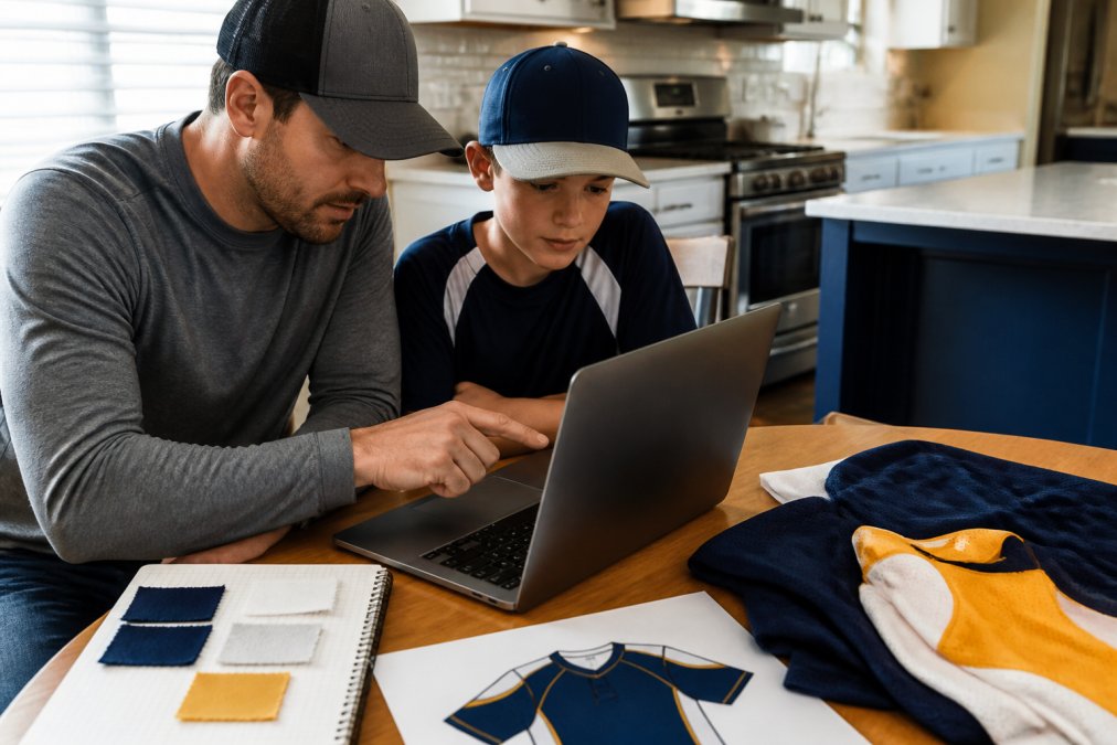
Most suppliers offer online design tools, sometimes called design labs or 3D builders. These let you place logos, pick colors, and preview the jersey before anything is printed. A mockup is a digital preview of the finished jersey.
Upload Logos and Artwork the Right Way
Vector graphics are the gold standard for logos because they scale to any size without getting blurry. If you only have a photo or screenshot, ask the original designer for the vector version first.
File formats that work best:
- Vector: .AI.EPS.SVG.PDF
- High-resolution raster: .PNG or .JPG at 300 DPI or higher
- Avoid: screenshots, social media downloads, and low-resolution images
Prepare Print-Ready Files Before You Submit
Print-ready files are artwork set up correctly for the printer: right resolution, right color mode, and clean edges. This is the step most teams skip, and where designs fall apart.
- Check resolution: 300 DPI minimum for any raster art
- Convert colors to CMYK for printing, not RGB
- Remove backgrounds so the jersey fabric shows through
- Keep text as outlines so fonts don't shift
Pick Team Jersey Color Combinations That Work on the Field
Team jersey color combinations should pass three tests: they look good together, they read clearly from a distance, and they don't clash with opponents' colors. That third one gets forgotten constantly.
Build Contrast With Value, Not Just Hue
Hue is the color itself, navy, gold, red. Value is how light or dark it is. Two colors can be different hues yet share nearly identical value, which is why a red number on a green jersey can vanish at 40 yards even though the colors "don't match."
Test Your Palette in Grayscale Before You Approve It
Grayscale is the fastest field-legibility check there is, and almost no design guide mentions it. Convert your mockup to grayscale (every design lab and most photo editors can do this). If the numbers, team name, and logo still separate cleanly from the jersey body, they'll separate on the field. If they blur into one gray mass, they'll blur in play too, under stadium lights, in rain, and in every sideline photo.
Account for Opponent Colors and League Restrictions
Before you lock a palette, list the colors of every team in your division. If three opponents wear navy and you're planning navy, you'll spend the season in a color clash referees and scorekeepers notice. Some leagues publish a color-restriction policy for exactly this reason; ask your director whether any palette is reserved.
| Palette Role | Example | Why It Works |
|---|---|---|
| Dominant | Navy | Anchors the jersey, hides dirt, dark value |
| Secondary | White | Light value creates strong number contrast |
| Accent | Gold | Pops on trim and lettering without competing |
Keep the Palette Consistent Across Every Piece
A palette only works if it's applied the same way on the jersey, shorts, socks, and warm-up gear. Hand your printer a written palette with exact color values (hex for screen, CMYK for print) so the gold on the sleeve matches the gold on the shorts. Suppliers who print each piece separately without a shared reference are a common source of mismatched uniforms.
Follow Jersey Logo Placement Guidelines for a Clean Look
Logo placement follows a few standard rules that keep a uniform looking professional. Chest logos sit on the left chest, roughly 7 to 9 inches down from the shoulder seam. Sleeve logos go on the outer sleeve, centered.
- Keep the primary logo on the chest
- Put sponsor or secondary marks on sleeves
- Leave at least a half inch of clear space around every logo
- Never overlap a logo with a seam or number
Add Player Names and Numbers Without Peeling
Peeling names and numbers almost always trace back to cheap application or a wrong fabric match. The fix is a printing method that bonds to the fabric instead of sitting on top of it.
Choose a Number Font That Reads From the Bleachers
Not every font that looks sharp in a design lab survives 40 yards. Numbers must be legible at a glance, in motion, and often in poor light. A few rules that hold up:
- Avoid thin or hairline strokes. Thin strokes disappear at distance and in photos. Block and slab-style numerals hold their shape.
- Avoid decorative or script numerals. A stylized "1" that reads as a "7" from the stands is a problem for everyone.
- Watch the 6 and the 8, the 3 and the 8, and the 0 and the 6. These pairs are the most commonly confused at distance. If your font makes them hard to tell apart, pick another.
- Keep the number large enough to read. League rules often set a minimum height (commonly in the 4- to 6-inch range for the front and larger on the back); confirm your league's minimum and design to it, not below it.
- Give the number breathing room. A number crowded by trim, a logo, or a seam loses legibility even if the font itself is fine.
Make Player Names Readable Too
Names are smaller than numbers, so they're harder to read from a distance. A few choices help:
- Use a clean sans-serif for names. Serif and script fonts lose detail at small sizes.
- Set names in all caps. All caps is the standard for jersey lettering because it reads more evenly than mixed case at small sizes.
- Keep the name short enough to fit without squeezing. If a long last name forces the letters to compress, the name becomes unreadable. Some suppliers offer a shorter form (first initial plus last name) for long names, ask before you submit.
- Match the name color to the number color. Mixing them creates visual noise and can violate league contrast rules.
Lock Down the Personalization Details Before You Order
Player personalization details to lock down:
- Exact spelling of every name, checked twice, and confirmed by the player, not just the parent
- Number font that stays legible from the bleachers
- Number size that meets league minimums
- Number uniqueness across the roster (no duplicates, and no numbers already retired by the league)
- Roster order so nothing gets swapped
Choose Fabric and Printing Method for the Whole Season
Fabric choice decides how the jersey feels in July heat and how it holds up through a full tournament schedule. Moisture-wicking polyester moves sweat away from the skin and dries fast. That matters when a team plays three games in one day.
Budget versus premium usually comes down to three things:
| Factor | Budget Option | Premium Option |
|---|---|---|
| Fabric | Basic poly blend | Performance moisture-wicking |
| Printing | Screen print | Sublimation |
| Durability | Fades over a season | Holds color for years |
Approve a Design Proof, Then Order in Bulk
A design proof is the final digital version of your jersey that the printer sends for approval. Nothing goes to production until you sign off.
Frequently Asked Questions
Is there an app that can design jerseys?
Yes. Most custom apparel providers offer browser-based design labs, and some have mobile apps where you pick a jersey template, drop in your logo, and see a 3D mockup before ordering. The catch is file quality: apps are fine for building the layout, but your logo still needs to be a clean vector or high-resolution file for printing. Design in the app, then confirm the final proof with the print team.
What file formats are required for custom jersey printing?
Send vector files like AI, EPS, or SVG whenever possible, since they scale without blurring. If you only have a raster logo, use PNG or JPG at 300 DPI or higher at the actual print size. Avoid screenshots and images pulled from social media, because they usually fall below the resolution needed for sublimation. Ask for a design proof before the run starts so any soft edges get caught early.
How do I choose the right fabric for team jerseys?
For travel tournaments and long days in the sun, pick a lightweight moisture-wicking polyester, often around 150 to 180 GSM. It keeps athletes cool and dries fast between games. Budget-friendly options are usually lighter and less durable across a full season, while premium fabrics hold their shape and color through repeated washes. Match the fabric weight to your sport and how often the team plays.
Can I design jerseys on Canva?
You can build a layout in Canva, but it is not built for print production. Export your design at 300 DPI with CMYK colors and check that no text or logo sits in the seam areas where fabric gets cut. Many teams use Canva for the concept and then hand the file to a jersey design team to convert into print-ready artwork. Always review a final proof before bulk ordering.